The debate over content blockers is an important one for our industry. I just wish web fonts weren't caught up in it.
— Jeffrey Veen (@veen)
September 18, 2015
As a designer “Block Webfonts” makes me… happy sad.
— iA Inc. (@iA)
September 18, 2015
@iA Webfonts (woff) actually are lean in data: 15–30kb/font. Stupid to block them because that decreases reading experience.
— Linotype (@Linotype_com)
September 18, 2015
So designers are not happy. But if you’re a user, chances are, [you’re][u4] [quite][u3] [relieved][u2] (or even [ecstatic][u1]) at the ability to block web fonts and experience a faster web. And web designers and front-end engineers have no one but themselves to blame for this.
[u1]: https://twitter.com/PeterssonJesper/status/644413985748615168
[u2]: https://twitter.com/JakeMoore/status/644293445528350720
[u3]: https://twitter.com/zacwest/status/644246065139478528
[u4]: https://twitter.com/sungo/status/644952897109798912
### How did we get here?
The web is primarily textual. [Typography][], thus, becomes an [essential component of web design][95 pc]. CSS features such as `@font-face` allow us web designers to enhance the typographic quality of our designs by giving us the freedom to use any font at our disposal. This is a good thing. No two ways about that (and more of the same, please).
But somewhere along the way, we forgot (or chose to ignore) that a user's experience of the web is made up of a wide range of factors, of which fonts are an important but not all encompassing part. Smooth performance and fast access to content are just as (if not more) important factors.
#### FOIT
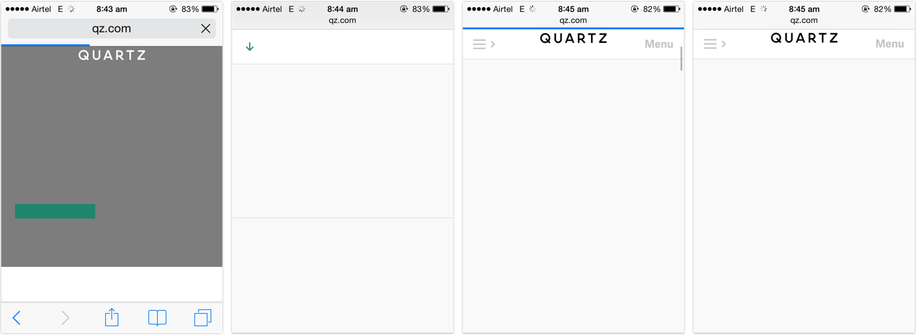
Far too many websites, far too often started resulting in situations such as this:
[typography]: http://practicaltypography.com/what-is-typography.html
[95 pc]: https://ia.net/know-how/the-web-is-all-about-typography-period
Dear front-end developers,
I’m on a train. I won’t mind a sudden switch of fonts, but I sure mind this endless wait for the fonts to load.
— Souvik Das Gupta (@souvikdg)
December 29, 2014
It shouldn't come as a surprise that people want to be able to read the news report in _Georgia_ or _Roboto_, or carry on with their shopping in _Arial_ rather than [stare at a blank screen][still words] for the rest of their train ride. Hence their joy and support for web font blockers.
[still words]: https://signalvnoise.com/posts/3404-reminder-design-is-still-about-words
---
The sense of dismay amongst designers hints at a deeper negligence. Why are designers disappointed on hearing that a certain feature might not be available to a certain subset of the people visiting their site? Is that not true for pretty much everything but the vanilla HTML we write? Or do we only concern ourselves for users with the latest software releases running on the most powerful hardware devices connected via the fastest networks?
With iOS 9 now able to block web fonts, it may be time for my amazing new paradigm-shifting dev methodology I call "Progressive Enhancement"
— Bruce Lawson (@brucel)
September 17, 2015
Web designers should know better. Websites should not come with _minimum software requirements_. Websites [should not feel doomed][fontstack] if one, or two (or three, or more) of the enhancements are unavailable [in a certain browser][ios9]. Granted, typography is a vital component of web design given the percentage of text on our pages, but it should not come at the cost of the ability to read. The dependence on web fonts for delivering great reading experiences further highlights our [mis-treatment of those web users that fall outside our local map][map territory].
[fontstack]: http://artequalswork.com/posts/better-css-font-stacks/
[ios9]: https://twitter.com/TrentWalton/status/644556750008422400
Users are pushing back against the abusive practises of the online advertising industry. Some might feel that in between this fight, web font blocking is the unfortunate collateral damage, but I disagree. I feel the culprits are the websites that chose FOIT over progressive enhacement. In the process of users [reclaiming faster access to content][frustrated], even the FOUT style web fonts have been blocked. That is the real collateral damage.
[frustrated]: https://twitter.com/tobytripp/status/644885057564487681
[^1]: [Bram Stein](https://twitter.com/bram_stein) has a great slide deck on [the current state of web font loading and performance](https://speakerdeck.com/bramstein/web-fonts-performance). Bram is also the author of the [FontFaceObserver script](https://github.com/bramstein/fontfaceobserver), which is our weapon of choice to implement a [progressive font loading strategy](https://gist.github.com/rungta/fa39058f1d15d6d4ea95), based on [the excellent work done by Filament Group](http://www.filamentgroup.com/lab/font-events.html). Recommended reading for web designers and front-end engineers.
*[FOUT]: Flash of Unstyled Text
*[FOIT]: Flash of Invisible Text
*[CSS]: Cascading Style Sheets
*[HTML]: Hyper Text Markup Language
[map territory]: https://vimeo.com/63525054 "Ethan Marcotte - The Map Is Not The Territory"
[blockers]: http://www.loopinsight.com/2015/09/16/a-list-of-content-blockers-for-ios-9/