Our blog

Page 1 of 2

  • What is Information Architecture?

    Author
    Souvik Das Gupta
    Published

    It’s often hard to define abstract, rudimentary and ubiquitous practices. Design is one such example which I’d touched upon earlier.

    Information Architecture (IA) belongs to a similar territory.

    Information architecture is the practice of deciding how to arrange the parts of something to be understandable.

    IA Institute

    Information architecture models are everywhere — printed material, digital documents, websites and even physical spaces (not typically thought of as information). It wouldn’t naturally occur that someone might have worked hard to make sense of mess to enable understanding and use.

    When it comes to defining information architecture, IAIs take is a good start. It attempts to describe IA through a specific activity. Several online references take a similar approach i.e. describing IA as an activity that involves drawing boxes”, arranging parts or organising, structuring, and labelling. This approach makes the definition a bit narrow and incomplete.

    Instead, taking a broader approach here’s an attempt to define Information Architecture—

    Information Architecture is the thoughtful, deliberate practice of achieving a shared mental model, and further applying it to make something understandable. Thoughtful, because it involves shedding biases and unseeing things as they appear (or are presented).

    Deliberate, because it involves making carefully considered and well-reasoned decisions.

    Practice, because it involves application of principles, theories, tools and processes towards a purpose.

    Shared, because it involves reaching parity in understanding of ideas and thoughts.

    Mental Model, because it involves representing assumptions, structures and arrangements people carry in their minds.

    Hope this adds to how we all understand IA.

  • Collateral Damage

    Author
    Prateek Rungta
    Published

    With the release of iOS 9 and its support for content blocking APIs, there has been an explosion of ad blockers that are proving only too popular with users. This has kicked off the long overdue debate about the malpractices of contemporary online advertisers, and the ethics of blocking said advertising. There have been numerous interesting perspectives on this issue, and rather than recounting them here, I urge you to read them for yourself:

    Instead, I wish to draw your attention to web fonts. A lot (if not most) of the ad blocker apps also support blocking of web fonts. Some restrict themselves to blocking font hosting services such as Typekit and Google Fonts, while others block all web fonts, self-hosted or otherwise. Designers, as some might have expected, have something to say about that.

    So designers are not happy. But if you’re a user, chances are, you’re quite relieved (or even ecstatic) at the ability to block web fonts and experience a faster web. And web designers and front-end engineers have no one but themselves to blame for this.

    How did we get here?

    The web is primarily textual. Typography, thus, becomes an essential component of web design. CSS features such as @font-face allow us web designers to enhance the typographic quality of our designs by giving us the freedom to use any font at our disposal. This is a good thing. No two ways about that (and more of the same, please).

    But somewhere along the way, we forgot (or chose to ignore) that a user’s experience of the web is made up of a wide range of factors, of which fonts are an important but not all encompassing part. Smooth performance and fast access to content are just as (if not more) important factors.

    FOIT

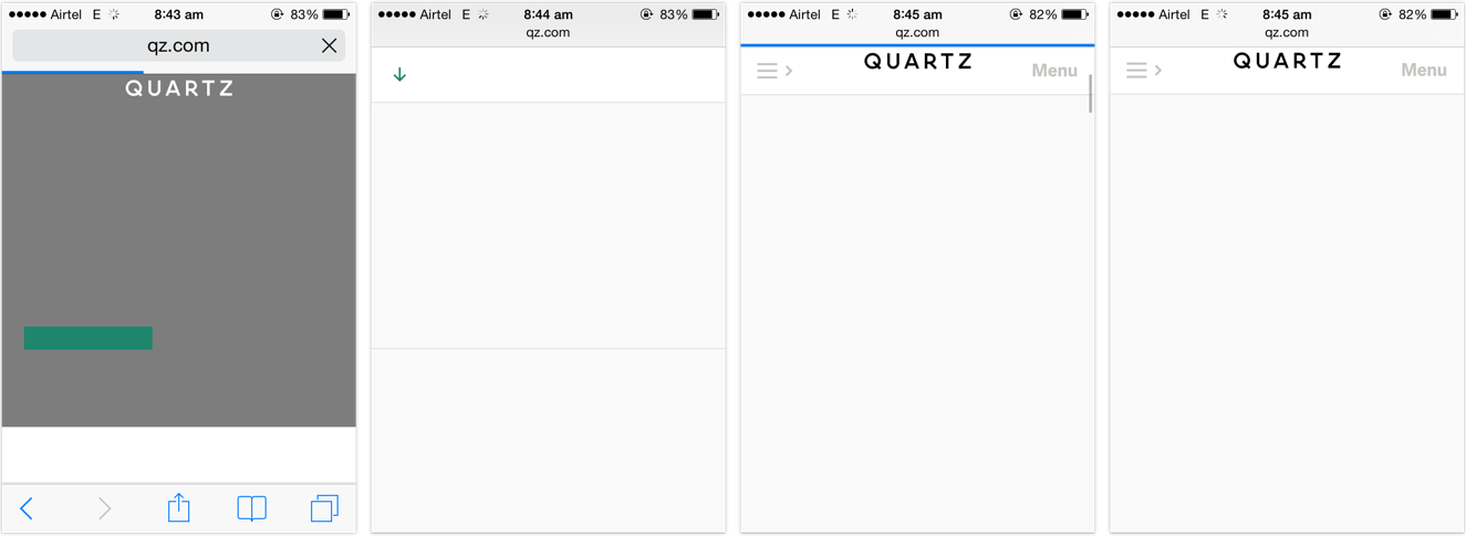
    Far too many websites, far too often started resulting in situations such as this:
    quartz home page with the base design rendered but no fonts and no readable text or headlines

    The page has been rendered. The content is available, but it isn’t accessible to be read until the web fonts finish downloading. This behaviour is called Flash of Invisible Text, or FOIT.

    FOIT is bad if you’re on a low-speed connection, because the text might be the last thing that becomes accessible on the page. FOIT is worse if you experience bad latency or lose network connection altogether and the fonts fail to download, leaving you with blank spaces where the text might’ve been.

    FOUT

    There is an alternate method, which starts off with making the text available on first render using local fallback fonts from the user’s system and applying the web fonts after — and if — they finish downloading. This behaviour is called Flash of Unstyled Text, or FOUT.

    Default browser handling of @font-face embeds has changed over the last few years, but web designers have more or less had control over going the FOIT or FOUT route right since web fonts gained popularity 1. Sadly, most websites chose invisible (FOIT) over accessible. They chose to hide the text until their preferred typefaces would finish downloading, resulting in longer wait times for the user. They treated web fonts not as an enhancement but as a requirement, seceding the functional high ground for higher quality typography.

    It shouldn’t come as a surprise that people want to be able to read the news report in Georgia or Roboto, or carry on with their shopping in Arial rather than stare at a blank screen for the rest of their train ride. Hence their joy and support for web font blockers.


    The sense of dismay amongst designers hints at a deeper negligence. Why are designers disappointed on hearing that a certain feature might not be available to a certain subset of the people visiting their site? Is that not true for pretty much everything but the vanilla HTML we write? Or do we only concern ourselves for users with the latest software releases running on the most powerful hardware devices connected via the fastest networks?

    Web designers should know better. Websites should not come with minimum software requirements. Websites should not feel doomed if one, or two (or three, or more) of the enhancements are unavailable in a certain browser. Granted, typography is a vital component of web design given the percentage of text on our pages, but it should not come at the cost of the ability to read. The dependence on web fonts for delivering great reading experiences further highlights our mis-treatment of those web users that fall outside our local map.

    Users are pushing back against the abusive practises of the online advertising industry. Some might feel that in between this fight, web font blocking is the unfortunate collateral damage, but I disagree. I feel the culprits are the websites that chose FOIT over progressive enhacement. In the process of users reclaiming faster access to content, even the FOUT style web fonts have been blocked. That is the real collateral damage.


    1. Bram Stein has a great slide deck on the current state of web font loading and performance. Bram is also the author of the FontFaceObserver script, which is our weapon of choice to implement a progressive font loading strategy, based on the excellent work done by Filament Group. Recommended reading for web designers and front-end engineers. ↩︎

  • Apple TV Human Interface Guidelines

    Author
    Prateek Rungta
    Published

    Very well put together. Worth your time both to better understand the new Apple TV interface as well as brush up on some universal principles like this on Navigation:

    People tend to be unaware of an app’s navigation until it doesn’t meet their expectations. Your job is to implement navigation in a way that supports the structure and purpose of your app without calling attention to itself. Navigation should feel natural and familiar, and shouldn’t dominate the user interface or draw focus away from content.

  • What’s Your Web

    Author
    Souvik Das Gupta
    Published
    Event
    Meta Refresh 2015
    Location & Date
    ·Bangalore, India

    The beauty of the web is in its ubiquity. Its unparalleled reach isn’t a mere co-incidence — rather, a 26 year long journey of consciously embracing the principles of inclusiveness. The minimal hardware and software requirements have enabled most electronic devices today to connect to the web. At the forefront are mobiles which have surpassed their predecessors, laptops and desktops, quite emphatically.

    Today, user experience on a mobile device affects way more people than any other device. With several low cost smartphones out in the market the web has been brought within reach of lower sections of the socio-economic pyramid — many for the very first time. In fact, for a large portion of the population, inexpensive mobiles connected to the internet over flaky mobile data connections are their only window to the web.

    Mobiles are a hard problem — in many ways it’s like going back a few years in terms of device power and capabilities. Even though we – the web designers and developers – largely acknowledge that mobiles are omnipresent, the user experience challenge these devices pose is often conveniently reduced down to an afterthought. And as a result, the state of mobile browsing continues to be in a mess with endless examples of essential services like banks assuming that users have the privilege of accessing a desktop or a laptop over a fast and reliable connection.

    We have ensured that key services are available to you on the mobile website. For other services, please continue to desktop login. — m.icicibank.com

    At Meta Refresh 2015, I shared a peek into what constitutes today’s web eco-system. A check on the real world impact of poor mobile web experiences — something we perhaps underestimate. It’s a call out to the community to own up the unremarkable state of mobile web, make the right compromises going forward and refuse to budge even though it may sound unrealistic and drastic.

  • Passwords are Obsolete

    Author
    Prateek Rungta
    Published

    Justin Balthrop:

    Everybody knows that most passwords will remain unchanged. Yet our collective response to Heartbleed has been to patch our servers and email users asking them to do something we know most of them won’t do.

    Here’s what our response should have been:

    ALTER TABLE users DROP COLUMN password;

    Justin goes on to suggest one-time authentication codes delivered via email and SMS as the replacement. Regardless of what you think of the suggested solution, if Heartbleed get us to re-evaluate passwords and adopt a better authentication protocol on the web, it might just end up being a net win for us all.

  • Overexposed

    Author
    Souvik Das Gupta
    Published
    Event
    Meta Refresh 2013
    Location & Date
    ·Bangalore, India

    Designers think about the fine details of stuff, so that users don’t have to worry about them.

    — Adapted from The Genius of Design: Ghosts in the Machine

    Creators — be it designers or business owners — build tools that make it simpler for people to do a job. Every tool has two sides: one that does the job, and another that exposes an interface to users. It is our responsibility to maintain a gap between the two so that users are not hassled by the complexities involved in the task.

    At Meta Refresh 2013, I gave a talk to highlight the problem of unnecessarily exposing implementation details to users. Little details that are easily overlooked while worrying about the larger scheme of things, e.g. URLs, button labels, error messages, etc. Sometimes we build a solution that simply passes on the problem to users.

    We’re not just fairly competent at designing systems but also extremely competent at using them. Clearly we differ from our users. This often limits our ability to recognise goof ups. We need to constantly question the effectiveness of our decisions to ensure that our designs are meaningful for users.

  • Preview: Our Sessions at Meta Refresh 2013

    Author
    Prateek Rungta
    Published

    HasGeek is organising Meta Refresh — a conference on the construction of user experience on the web” — at Bangalore later this month.

    We are going to be speaking at the event and we put together two short videos to introduce our talks.

    Above: Souvik introduces his talk Overexposed — a call for proactively reducing the exposure of implementation details in our work. Syntax laden URLs, as an example.

    Below: Prateek introduces his talk Design by Philosophy — an approach to making design decisions based on the most basic forms of ideas — philosophies.

    The conference takes place on the 22nd and 23rd February at the MLR Convention Centre in Bangalore and tickets are still available.

    Hope to see you there!