Our blog

Page 10 of 11

  • Stripe

    Author
    Prateek Rungta
    Published

    A new payment solution with a single-minded focus on their customers—the developers. Stripe looks like a refreshing glass of cold water in the desert land that is internet payment gateways. Everything about them defies the current market of payment solutions that developers have to put up with in-order to accept payments on the web: a clear and unambiguous offering, crisp communication, good documentation and all with a straightforward (and perhaps, quite friendly) pricing.

    The best thing about Stripe, however, is their approach to the payments problem. Unlike most gateways, what Stripe offers is an API and not an interface which redirects back–and–forth. This gives app developers complete freedom to design and optimise the experience of accepting payments from their end-users.

    Our only gripe? They’re U.S. only (for now). India can really do with some good payment solutions. We can’t wait to integrate Stripe (what with, hmm) as soon as they start paying out to Indian accounts.

  • Typography for the Web

    Author
    Prateek Rungta
    Published
    Event
    Tenmiles Internal Seminar
    Location & Date
    ·Chennai, India

    The web is at its most powerful when used as a communication medium. Even as it evolves supporting richer formats every day, text remains the most basic and widely used format for expressing ourselves online. Ubiquitous almost. And given this ubiquity, it becomes pretty important for web designers to ensure that the message contained in those letters and words is conveyed as efficiently as possible. In fact, Oliver Reichenstein makes a compelling argument that 95% of web design is typography.

    Typography is an important part of written communication, but not its sum total. There are other aspects like engagement and clarity that are just as important. This presentation thus begins by highlighting the process, setting the priorities right. It then goes on to some basic guidelines one can follow to improve the readability of the written word, and ends with a tease into some of the finer aspects of typography. The presentation concludes with two clips from Gary Hustwit’s excellent design trilogy that you can watch on YouTube: Michael Bierut on Helvetica and Deiter Rams on Good Design.

    Like any worthy skill, grasping typography requires time and effort. Serious web designers would do well to invest both. This presentation though was made to serve as a starting point / basic introduction to the subject. Hope it helps!

  • Our 4 Questions

    Author
    Souvik Das Gupta
    Published

    Introducing projects to someone else who will bring your ideas to life can get really painful. We know, we’ve faced it ourselves.

    Most respected web design shops have identified this problem and have attempted to solve it by using questionnaires with 15 to 20 questions as a starting point of introduction. A long questionnaire, almost as good as detailed documentation can be difficult to answer at such a nascent stage. Thoughts at this stage of a project are usually clear at the micro level, but most macro level details get clearer only as one progresses with the execution. Many a times one looks to seek advice rather than knowing it all. Steve Jobs nailed it when he said It isn’t the consumers’ job to know what they want.” We concur. Such questionnaires are a step to simplify things, but we think that it could be made simpler.

    Going by our Keep it Simple, Stupid principle, we have come up with just 4 questions. These are the most basic and natural questions you would encounter whenever you go out to buy anything, be it a table, a shirt or a computer.

    Hi, how can I help you?
    I want to buy a computer.

    For whom?
    My son, he’s 15. And sometimes my wife will use it, though she doesn’t know much about computers.

    What will they use it for?
    Well, simple things, maybe play some games and watch a few movies. And of course, browse the internet.

    A customer should never be expected to specify how fast the processor should be or how much power the device should draw or even whether he needs a mouse (iPads for instance don’t have a mouse, but can still serve his purpose). If they know, that’s good, but we suggest consulting the experts before forming a mindset.

    However, unlike buying things off-the-shelf, customised design and development jobs provide a huge room for flexibility. Hence it is very important to determine the size of the project. I want my website to look like that” or I want the website to have this feature” is a very small portion of the large pie. Micro level product definitions do not take into account the optionals like legacy browser support, responsive design, CMS integration etc. In many cases these variable components drastically affect the size of the project.

    One way of defining size is by investing significant time and money documenting every little detail of your project. Unfortunately, making this list exhaustive is nearly impossible. Additionally, rarely does such a document go unaltered as a project progresses. No surprises that we prefer not taking this route. The other way of estimating size is by knowing the time and budget constraints. Well, everyone has a budget up their sleeves, but very few like to share it. While we understand their concerns for not being looted by a design shop, it is important to appreciate that the same goals may be achieved by drastically differently sized projects.

    The 4 Questions
    1. Your project in 140 characters (or less).
    2. Who are your primary and secondary set of targeted audience?
    3. What are your 3 most important expectations from the users who visit your project?
    4. What are your time and budget constraints?

    If clients share definitive and unambiguous answers to these 4 questions, everything else falls in place. That is why we have put soft constraints (140 chars, 3 expectations etc.) on every question. At this stage, we want only the essential user-centric’ goals of the project. Our designs are user-focused and these goals have our primary attention throughout. We know that only happy users translate into long-term happy clients. Nothing else matters.
  • Crane Brothers

    Author
    Prateek Rungta
    Published

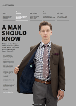
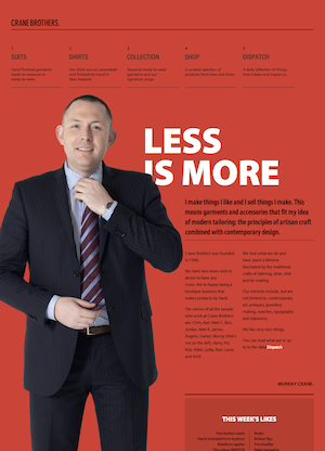
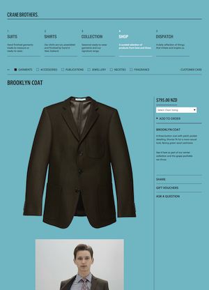
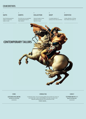
    This boutique tailor shop from Auckland recently launched a fantastic new website and there’s much to like. They’ve cleverly packed in a rich and classical (yet contemporary) look.

    Crane Brothers - Contemporary Crane Brothers - Shirts Crane Brothers - Murray Crane Crane Brothers - Shop

    The strong adherence to and communication of the grid, a single type family, and the lack of graphics (save a single bold photograph) give it the classical feel. The choice of Myriad Pro (Condensed for headlines) as the typeface gives it that modern look. Combine these with ample whitespace, great copy and you have as rich and tasteful a site as you could ask for.

    Built for Crane Brothers by Sons & Co., also from New Zealand. (via Typekit)

  • Knowing How

    Author
    Prateek Rungta
    Published

    Ryan Singer on learning apprentice-style”:

    It’s really darn hard to take all the physical and mental processes going on when you do something like design an interface and boil them down to declarative statements like do this or that.”

    Both of us here at Miranj are self-taught. Sure we’re qualified software engineers, but user experience, product design, system architecture, progressive enhancement — the meat of what we do — are all things we learned by doing and not in the classroom. This is not to undermine classroom education, but there really is no substitute for getting your hands dirty. And what better than a mentor with years’ worth of dirty hands?