Our blog

Page 7 of 8

  • Overexposed

    Author
    Souvik Das Gupta
    Published
    Event
    Meta Refresh 2013
    Location & Date
    ·Bangalore, India

    Designers think about the fine details of stuff, so that users don’t have to worry about them.

    — Adapted from The Genius of Design: Ghosts in the Machine

    Creators — be it designers or business owners — build tools that make it simpler for people to do a job. Every tool has two sides: one that does the job, and another that exposes an interface to users. It is our responsibility to maintain a gap between the two so that users are not hassled by the complexities involved in the task.

    At Meta Refresh 2013, I gave a talk to highlight the problem of unnecessarily exposing implementation details to users. Little details that are easily overlooked while worrying about the larger scheme of things, e.g. URLs, button labels, error messages, etc. Sometimes we build a solution that simply passes on the problem to users.

    We’re not just fairly competent at designing systems but also extremely competent at using them. Clearly we differ from our users. This often limits our ability to recognise goof ups. We need to constantly question the effectiveness of our decisions to ensure that our designs are meaningful for users.

  • Preview: Our Sessions at Meta Refresh 2013

    Author
    Prateek Rungta
    Published

    HasGeek is organising Meta Refresh — a conference on the construction of user experience on the web” — at Bangalore later this month.

    We are going to be speaking at the event and we put together two short videos to introduce our talks.

    Above: Souvik introduces his talk Overexposed — a call for proactively reducing the exposure of implementation details in our work. Syntax laden URLs, as an example.

    Below: Prateek introduces his talk Design by Philosophy — an approach to making design decisions based on the most basic forms of ideas — philosophies.

    The conference takes place on the 22nd and 23rd February at the MLR Convention Centre in Bangalore and tickets are still available.

    Hope to see you there!

  • The Ageing User Authentication Paradigm

    Author
    Prateek Rungta
    Published

    Aarron Walter over at MailChimp has a good assessment of the Twitter, Facebook et al., login buttons that have become common all over the web. He makes a convincing argument that these social login buttons do more harm than good. But if we take a step back, there is a more interesting story to explore in there.

    From April 12 to May 12, 2012, we had 340,591 failed login attempts. That’s the total number of times someone tried to get into MailChimp to get their work done and couldn’t remember their username and/​or password, or simply mistyped. Think of how much wasted time and frustration that translates to.

    The reason MailChimp turned towards third party OAuth solutions in the first place was to reduce the high number of login failures. While they’ve had some success in reducing this failure rate (attributed to better copy and improved error handling), the number of failures remain high enough to be a cause for concern. And MailChimp is hardly alone in this regard.

    The traditional username + password based authentication paradigm has served us well over the years. It is almost second nature to any seasoned web user today. In fact, it is so widespread that you need not be an expert to realise the terrible experience or flimsy security it provides.

    Of the people who struggled logging in, 68,145 had to resort to resetting their password, and 38,137 had to get a reminder about their username.

    The need to come up with memorable credentials, to make passwords cryptic, keep them confidential at all times, not see what you’re typing, to remember the correct combination of the different services, usernames and passwords (and at times password recovery answers) you’ve created, easily stolen identities, increasing susceptibility to brute force attacks, and above all the general inconvenience of getting to your data.

    None of this is a revelation. Designers and engineers have long been aware of this less-than-stellar situation and various efforts to address the same have been made over the years. Incremental usability improvements like not asking people to re-type passwords during sign-up, letting people see what they type, using email addresses for usernames etc. have definitely helped. As have efforts to fundamentally replace the username + password auth system, such as OpenId, OAuth and the likes.

    Unfortunately, none of the replacements have been as successful as the system they were trying to replace. Yet the need for a replacement is more dire than ever. More people are using the web and putting their information online than ever before and our existing authentication process is intrusive, inconvenient, and not entirely secure. There are encouraging developments like Mozilla’s Persona (née BrowserID) and the push for no passwords’, but it is early days still and the ground is very much open for a sweeping change.

  • Celebrating Design, Simplicity and Taste

    Author
    Prateek Rungta
    Published

    This post was meant to be published last October but had been sitting in our drafts. Here it is, one year on…

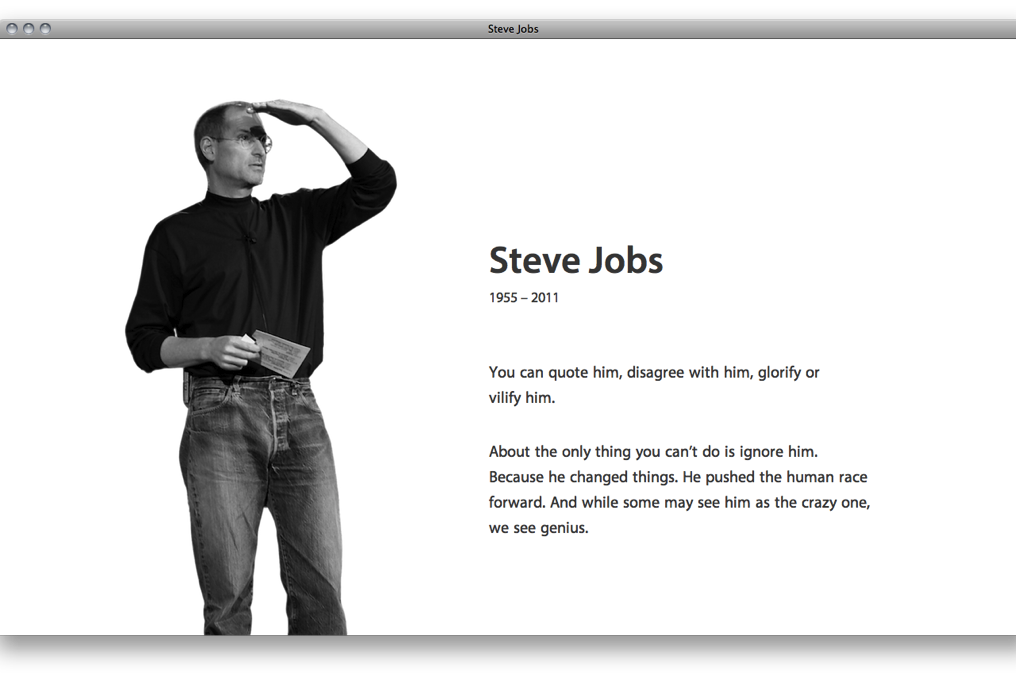
    It is unfortunate that what started as an honorary project showcasing the highs of Steve Jobs’ career had to abruptly change track and be unveiled as a homage to a dead man.

    Steve Jobs - Miranj steve​jobs​.miranj​.in

    We like to think of the incredible outpour of tributes as a celebration of Steve Jobs’ life instead of mourning at his passing. A celebration of good design, of sweating the details, of running a business on the basis of great work and of having the cheek to think you can actually change the world.

  • Miranj Turns One

    Author
    Souvik Das Gupta
    Published

    I still remember the days at my last job where I clocked hours” while doing mundane tasks. Every passing moment seemed forever — full of boredom, monotony and a test of patience. It is hard for me to remember every moment that I’ve lived, but the ones I do recall tend to have a strong emotional connection. These are the moments that add up to make minutes, hours, days and months of my memories.

    We started Miranj with a hope to achieve our sweet spot. With unexpected hurdles at each step, even simple things — be it choosing a name, finding a good accountant, interpreting legal speak, searching for office space, signing our first client or opening a bank account — weren’t easy. Along the way we have often swatted flies at the office, endured words of concern from our parents and panicked for the lack of funds. And then there were days when we were simply overjoyed. There were moments of sadness, courage, anguish, desperation, joy, pride, satisfaction and learning.

    These moments, today, add up to a full year. Never before has time passed so fast.

    We just turned one!

  • Coming Soon

    Author
    Souvik Das Gupta
    Published

    Watch this space for our upcoming blog post!

    Imagine for a second that this post had ended with just that one line. After making an effort to reach this blog, how would you have felt?

    If I were to guess, it would’ve been one of the following:

    • The post isn’t even out. Pointless!
    • What a waste of a visit!
    • Crap! Made a fool of myself by following a worthless link.
    • Dickheads!

    Now suppose this weren’t a mere blog post, but a really promising product that managed to catch your attention. You need want this product. You are excited about it and land on this page only to find out that it’ll be coming soon.

    This time what could possibly be your reaction? Perhaps—

    Can’t wait! When is this coming?

    In both cases, the user undergoes a certain level of discomfort, anxiety and isn’t really happy about the situation. Yet the internet is littered with such heartless coming soon” pages. In earlier days an under-construction” sign (at times accompanied by a short animation) was put up when a website or a webpage was under development. The trends changed over the years and this was replaced by an optimistic, future-oriented and more promising coming soon” sign. The plan is to generate excitement, build traction and finally a big bang on release day! The motive is undoubtedly good, but seldom do plans work out as expected. A more likely outcome is a frustrated user. We’ve been victims ourselves.


    Recently, one of our friends who was quite disturbed about the coming soon” sections on his family business website confessed, No one is working on it to bring it up soon!”. Very few stakeholders foresee these problems early enough, counting instead on their clear plan”. Let’s analyse a couple of them:

    We plan to build a product. Let’s quickly put up a coming soon page to keep people interested in our idea and then start building the product.

    This move might serve as a promise and commitment to deliver, but it suffers from some fundamental flaws. First, the real’ work is pushed for later and instead a coming soon” page is worked upon. Second, it is extremely hard to visualise the final product. In a software project, where change is a lot easier than in a traditional brick-and-mortar project, plans change very often (even while the product is being developed); the final product rarely matches the creator’s original vision. Chances are quite high that the coming soon” page would have promised something different. Finally, there is an assumption that the project will ship and not turn into vapourware.

    We plan to launch this application with Use Cases A, B & C. We’ll launch the website as soon as Use Case A is ready and Use Cases B & C can link to a coming soon page. While our Use Case A seeks traction we’ll work on the remaining features.

    Again in this case, once a product goes live the focus from the pending features can easily be lost. User feedback, bugs and scalability are just a few things that might de-prioritise the work on Use Cases B & C. Trust us, refinements can take forever. Not to mention the possibility of a new use case being born. Ain’t it better to not pre-emptively market Use Cases B & C?

    So, when to do a coming soon” page?

    For starters, certainly not before the product itself is ready. Once the product is built, nothing like taking the audience directly to the product instead of painting a rosy image in their minds and letting it rot by the time they get to the real product. Important to note, soon” indicates an amount of time that is subjective. It is hard to tell by when the excitement completely dies out, or worse, turns into contempt.

    However, in case one does wish to put up a teaser, setting the right expectations (both in terms of the product features/​offerings and the timelines) is important. Only once the product has been built can that be achieved. Build the product, set clear expectations and promise a date. Just how Apple does. Heck, even Virgle conveyed clear timelines!

    Now come back soon for our next post. Just kidding!
  • Stripe

    Author
    Prateek Rungta
    Published

    A new payment solution with a single-minded focus on their customers — the developers. Stripe looks like a refreshing glass of cold water in the desert land that is internet payment gateways. Everything about them defies the current market of payment solutions that developers have to put up with in-order to accept payments on the web: a clear and unambiguous offering, crisp communication, good documentation and all with a straightforward (and perhaps, quite friendly) pricing.

    The best thing about Stripe, however, is their approach to the payments problem. Unlike most gateways, what Stripe offers is an API and not an interface which redirects back – and – forth. This gives app developers complete freedom to design and optimise the experience of accepting payments from their end-users.

    Our only gripe? They’re U.S. only (for now). India can really do with some good payment solutions. We can’t wait to integrate Stripe (what with, hmm) as soon as they start paying out to Indian accounts.