Our blog

Page 2 of 2

  • Typography for the Web

    Author
    Prateek Rungta
    Published
    Event
    Tenmiles Internal Seminar
    Location & Date
    ·Chennai, India

    The web is at its most powerful when used as a communication medium. Even as it evolves supporting richer formats every day, text remains the most basic and widely used format for expressing ourselves online. Ubiquitous almost. And given this ubiquity, it becomes pretty important for web designers to ensure that the message contained in those letters and words is conveyed as efficiently as possible. In fact, Oliver Reichenstein makes a compelling argument that 95% of web design is typography.

    Typography is an important part of written communication, but not its sum total. There are other aspects like engagement and clarity that are just as important. This presentation thus begins by highlighting the process, setting the priorities right. It then goes on to some basic guidelines one can follow to improve the readability of the written word, and ends with a tease into some of the finer aspects of typography. The presentation concludes with two clips from Gary Hustwit’s excellent design trilogy that you can watch on YouTube: Michael Bierut on Helvetica and Deiter Rams on Good Design.

    Like any worthy skill, grasping typography requires time and effort. Serious web designers would do well to invest both. This presentation though was made to serve as a starting point / basic introduction to the subject. Hope it helps!
  • Crane Brothers

    Author
    Prateek Rungta
    Published

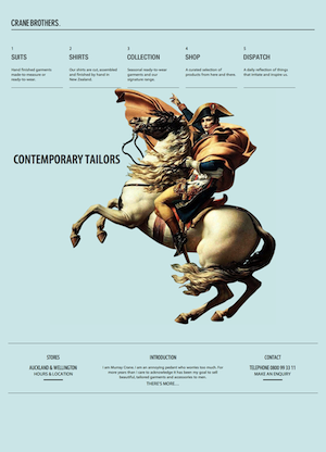
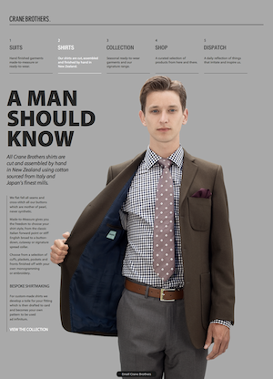
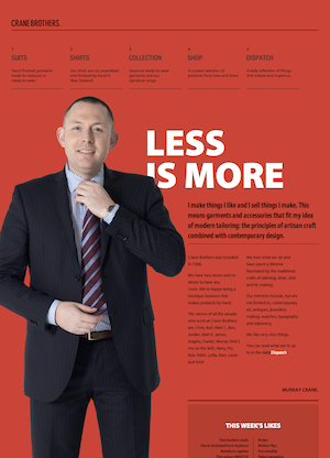
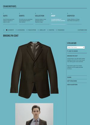
    This boutique tailor shop from Auckland recently launched a fantastic new website and there’s much to like. They’ve cleverly packed in a rich and classical (yet contemporary) look.

    Crane Brothers - Contemporary Crane Brothers - Shirts Crane Brothers - Murray Crane Crane Brothers - Shop

    The strong adherence to and communication of the grid, a single type family, and the lack of graphics (save a single bold photograph) give it the classical feel. The choice of Myriad Pro (Condensed for headlines) as the typeface gives it that modern look. Combine these with ample whitespace, great copy and you have as rich and tasteful a site as you could ask for.

    Built for Crane Brothers by Sons & Co., also from New Zealand. (via Typekit)

  • Knowing How

    Author
    Prateek Rungta
    Published

    Ryan Singer on learning apprentice-style”:

    It’s really darn hard to take all the physical and mental processes going on when you do something like design an interface and boil them down to declarative statements like do this or that.”

    Both of us here at Miranj are self-taught. Sure we’re qualified software engineers, but user experience, product design, system architecture, progressive enhancement — the meat of what we do — are all things we learned by doing and not in the classroom. This is not to undermine classroom education, but there really is no substitute for getting your hands dirty. And what better than a mentor with years’ worth of dirty hands?