Our blog

  • Micro-caching in Nginx for High Performance

    Author
    Prateek Rungta
    Published
    Event
    Bangalore Site Speed 6th Edition
    Location & Date
    ·Online

    In the vast, multi-layered subject area of web performance, server response time is an important metric. From a CMS standpoint, however, it is one of the most significant. Best practise recommends a 200ms or lower time-to-first-byte. For medium to high-traffic sites, server load is another vital statistic.

    We were invited to talk about our learnings from optimising and hosting high-traffic sites such as Guiding Tech at the sixth edition of the Bangalore Site Speed Meetup.

    Bangalore Site Speed Meetup 6th Event on YouTube.

    In this talk we go over caching as a broad performance strategy, before dive into micro-caching as a specific approach to handle loads of 10 to 100 concurrent requests per second. We cover the filter, storage, and invalidation implementations1 of this caching strategy in Nginx. The talk concludes by comparing metrics of our caching strategy against a target of achieving sub-200ms TTFB response times for all visitors.

    This talk is a newer revision of the Fortifying Craft CMS for High Traffic talk from 20192 which, as it says on the tin, was specifically tailored for Craft CMS based workflows. In this edition we focus on just micro-caching as a strategy and look at it independent of any specific CMS running at the application layer.

  • Critical CSS for CMS-based, Server-rendered Websites

    Author
    Prateek Rungta
    Published
    Event
    CSS loading and Critical CSS
    Location & Date
    ·Online

    Our sites have undeniably grown in complexity over the years. Each year we send more data, show bigger images and process lots more JavaScript per page than the year before, growing steadily for at least the last decade and outpacing the gains we’re making in computing and network capacity. The bloating of the web hasn’t gone unnoticed though — sites take their own sweet time to load, eat through data allowances, drain out the battery and bring the computer down to a crawl. Thankfully, the web community realises and acknowledges the problem. Performance is no longer an afterthought. Yet it is no easy band-aid either. Performance is impacted by a multitude of factors, so achieving success in this domain requires a multitude of solutions.

    The folks at Hasgeek recently put together an event focused on Critical CSS (under the JSFoo(!) banner) and we got on stage to share how we approach and implement this technique on sites we build at Miranj.

    Critical CSS for CMS-based, Server-rendered Websites on Vimeo.

    We look at an end-to-end solution that we have evolved and battle tested over the years. Starting with a primer on Critical CSS and its place in the larger performance pie, I go over a 4‑part strategy to introduce Critical CSS generation and delivery to a CMS-based website. We look at some performance metrics impacted by Critical CSS, cover identifying target templates and page selection, leveraging the Critical library to extract critical CSS, automating the extraction process using Gulp, reducing response size for repeat visitors, and getting this entire system to work with the caching layer(s) that you may already be using.

  • Fortifying Craft CMS for High Traffic

    Author
    Prateek Rungta
    Published
    Event
    Dot All 2019
    Location & Date
    ·Montréal, Canada

    In the vast, multi-layered subject area of web performance, server response time is an important metric. From a CMS standpoint however, it is one of the most significant. Best practise recommends a 200ms or lower time-to-first-byte (TTFB). That is the time in which a CMS has to figure out what to do with the request, parse templates, query the database, render the HTML, capture it all and send it back as the response.

    Craft CMS — our preferred CMS for content-heavy websites here at Miranj — is quite fast out of the box, but as our pages and content models grow in complexity so does the server response time. Add traffic to that mix and it can quickly lead to poor TTFBs and slow overall experience.

    In this talk we go through a multi-tiered caching strategy using Craft and Nginx that enables a single VPS to consistently deliver sub-200ms response times, even while handling loads of 10 to 100 concurrent requests per second. It covers our learnings from optimising a low-powered server to handle millions of visitors each month on the Guiding Tech website project. We achieve this by caching the website at two places — at the web server level using Nginx’s FastCGI micro-caching, and at the CMS level using flag-based template caches in Craft CMS. We also factor in real-world edge cases such as bypassing the cache, delivering variations to different visitors, etc, that are necessary to account for in a robust, production-ready system.

    Fortifying Craft for High Traffic with Prateek Rungta from Craft CMS on Vimeo.

    We also put out a sample Nginx config for the micro-caching strategy discussed in the slides.


    This talk was prepared for and delivered at Dot All 2019 in MontrĂ©al, Canada. This was my first time speaking at a conference outside India, but any nervousness I carried on stage was quickly dispelled by the warm engagement and wonderful conversations with the Craft community.

    Prateek speaking at Dot All 2019 Souvik and Prateek share a laugh with Ben Parizek of Barrel Strength Design

    Photographs courtesy Pixel & Tonic

    I’m extremely grateful to the folks at Pixel & Tonic for extending me an opportunity to present to an international audience, and for placing their trust in us a second time after Souvik’s talk the previous year at Dot All 2018, Berlin.

    I email hidden; JavaScript is required about your mileage from adopting any of the caching strategies mentioned in the talk, or any alternate approaches you have implemented to optimise Craft CMS for heavy loads and high traffic.

  • Page Loading Performance Strategies

    Author
    Prateek Rungta
    Published
    Event
    ReactFoo Delhi
    Location & Date
    ·New Delhi, India

    Performance on the web isn’t a simple switch that can be flipped on, but a vast, multi-layered subject. Page loading speed is one of the layers that has received a fair bit of attention recently thanks to tools like PageSpeed Insights and WebPageTest. While these profilers serve as great checklists to measure our sites against, their recommendations can often be difficult to incorporate or grasp fully.

    In this talk, presented originally at the Delhi 2018 edition of ReactFoo, I examine and demystify modern front-end page loading best practises. For each performance strategy, we break down the why and how. We go through the principles on which these loading strategies are based, and look at ways to implement the strategies with real-life examples.

    The ideas and experiences presented in this talk are based on my experience building and maintaining CMS-based websites for clients both large and small. However, these learnings and performance gains should be applicable to all websites, independent of the technology stack.

  • Collateral Damage

    Author
    Prateek Rungta
    Published

    With the release of iOS 9 and its support for content blocking APIs, there has been an explosion of ad blockers that are proving only too popular with users. This has kicked off the long overdue debate about the malpractices of contemporary online advertisers, and the ethics of blocking said advertising. There have been numerous interesting perspectives on this issue, and rather than recounting them here, I urge you to read them for yourself:

    Instead, I wish to draw your attention to web fonts. A lot (if not most) of the ad blocker apps also support blocking of web fonts. Some restrict themselves to blocking font hosting services such as Typekit and Google Fonts, while others block all web fonts, self-hosted or otherwise. Designers, as some might have expected, have something to say about that.

    So designers are not happy. But if you’re a user, chances are, you’re quite relieved (or even ecstatic) at the ability to block web fonts and experience a faster web. And web designers and front-end engineers have no one but themselves to blame for this.

    How did we get here?

    The web is primarily textual. Typography, thus, becomes an essential component of web design. CSS features such as @font-face allow us web designers to enhance the typographic quality of our designs by giving us the freedom to use any font at our disposal. This is a good thing. No two ways about that (and more of the same, please).

    But somewhere along the way, we forgot (or chose to ignore) that a user’s experience of the web is made up of a wide range of factors, of which fonts are an important but not all encompassing part. Smooth performance and fast access to content are just as (if not more) important factors.

    FOIT

    Far too many websites, far too often started resulting in situations such as this:

    quartz home page with the base design rendered but no fonts and no readable text or headlines

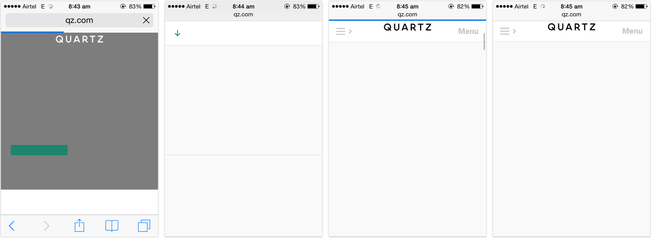
    The page has been rendered. The content is available, but it isn’t accessible to be read until the web fonts finish downloading. This behaviour is called Flash of Invisible Text, or FOIT.

    FOIT is bad if you’re on a low-speed connection, because the text might be the last thing that becomes accessible on the page. FOIT is worse if you experience bad latency or lose network connection altogether and the fonts fail to download, leaving you with blank spaces where the text might’ve been.

    FOUT

    There is an alternate method, which starts off with making the text available on first render using local fallback fonts from the user’s system and applying the web fonts after — and if — they finish downloading. This behaviour is called Flash of Unstyled Text, or FOUT.

    Default browser handling of @font-face embeds has changed over the last few years, but web designers have more or less had control over going the FOIT or FOUT route right since web fonts gained popularity 1. Sadly, most websites chose invisible (FOIT) over accessible. They chose to hide the text until their preferred typefaces would finish downloading, resulting in longer wait times for the user. They treated web fonts not as an enhancement but as a requirement, seceding the functional high ground for higher quality typography.

    It shouldn’t come as a surprise that people want to be able to read the news report in Georgia or Roboto, or carry on with their shopping in Arial rather than stare at a blank screen for the rest of their train ride. Hence their joy and support for web font blockers.


    The sense of dismay amongst designers hints at a deeper negligence. Why are designers disappointed on hearing that a certain feature might not be available to a certain subset of the people visiting their site? Is that not true for pretty much everything but the vanilla HTML we write? Or do we only concern ourselves for users with the latest software releases running on the most powerful hardware devices connected via the fastest networks?

    Web designers should know better. Websites should not come with minimum software requirements. Websites should not feel doomed if one, or two (or three, or more) of the enhancements are unavailable in a certain browser. Granted, typography is a vital component of web design given the percentage of text on our pages, but it should not come at the cost of the ability to read. The dependence on web fonts for delivering great reading experiences further highlights our mis-treatment of those web users that fall outside our local map.

    Users are pushing back against the abusive practises of the online advertising industry. Some might feel that in between this fight, web font blocking is the unfortunate collateral damage, but I disagree. I feel the culprits are the websites that chose FOIT over progressive enhacement. In the process of users reclaiming faster access to content, even the FOUT style web fonts have been blocked. That is the real collateral damage.


    1. Bram Stein has a great slide deck on the current state of web font loading and performance. Bram is also the author of the FontFaceObserver script, which is our weapon of choice to implement a progressive font loading strategy, based on the excellent work done by Filament Group. Recommended reading for web designers and front-end engineers. â†©ď¸Ž

  • What’s Your Web

    Author
    Souvik Das Gupta
    Published
    Event
    Meta Refresh 2015
    Location & Date
    ·Bangalore, India

    The beauty of the web is in its ubiquity. Its unparalleled reach isn’t a mere co-incidence — rather, a 26 year long journey of consciously embracing the principles of inclusiveness. The minimal hardware and software requirements have enabled most electronic devices today to connect to the web. At the forefront are mobiles which have surpassed their predecessors, laptops and desktops, quite emphatically.

    Today, user experience on a mobile device affects way more people than any other device. With several low cost smartphones out in the market the web has been brought within reach of lower sections of the socio-economic pyramid — many for the very first time. In fact, for a large portion of the population, inexpensive mobiles connected to the internet over flaky mobile data connections are their only window to the web.

    Mobiles are a hard problem — in many ways it’s like going back a few years in terms of device power and capabilities. Even though we – the web designers and developers – largely acknowledge that mobiles are omnipresent, the user experience challenge these devices pose is often conveniently reduced down to an afterthought. And as a result, the state of mobile browsing continues to be in a mess with endless examples of essential services like banks assuming that users have the privilege of accessing a desktop or a laptop over a fast and reliable connection.

    We have ensured that key services are available to you on the mobile website. For other services, please continue to desktop login. — m.icicibank.com

    At Meta Refresh 2015, I shared a peek into what constitutes today’s web eco-system. A check on the real world impact of poor mobile web experiences — something we perhaps underestimate. It’s a call out to the community to own up the unremarkable state of mobile web, make the right compromises going forward and refuse to budge even though it may sound unrealistic and drastic.